I take an interest in what the UK’s Office for National Statistics puts out, especially around employment and the economy. I’m also learning Jupyter and the Python DS tools, so I’ve taken one of their data series and tidied it up to use in Pandas.
Category: Data
Jupyter Experiment
I know all the cool kids have been using it for years. I thought I should give it a try. Currently working through Applied Data Science with Python and Jupyter, but this is not from the book.
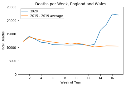
The desired output of this is the line graph showing the relationship between average weekly deaths in England and Wales, and weekly deaths this year. This is it:
Moving the Electoral Needle
Labour took one hell of a beating, and they’re electing a new leader. Those in favour of continuity sometimes produce figures aiming to show that continuity is fine, and can bring victory.
So here are four graphs of things that might matter, versus the number of seats won. One of these is not like the other three.